Identifying Statistical Irregularities in the 2024 Georgian Parliamentary Elections
The 2024 Georgian Parliamentary elections were held last Saturday, October 26th. Since the moment polls opened, numerous accounts of malpractice have been reported: international observers have identified instances of vote-buying, ballot stuffing, election carousels, as well as intimidation and violence against the observers themselves. The opposition party and president Salome Zourabichvili have denied the results, and called for a re-run of the elections and an investigation into the irregularities. The ruling Georgian Dream (GD) party maintains everything was carried out fairly and honestly.
Very often, fraudulent elections can be identified through various statistical ‘fingerprints’ in the reported results. The Georgian Central Election Comission (CEC) has made the results publically available, and there has been some excellent analysis done already; one popular observation (first made by Roman Udot here and Levan Kvirkvelia here) is that the distribution of support for the ruling party (expressed as the % of votes cast going to GD) across polling stations is almost – but not quite – a normal distribution, with a ‘tail’ in the high-GD-support end of the curve: a pattern which suggests an abnormally high number of strongly pro-GD polling results. This is especially prominent when the data from rural areas is isolated, i.e. polling stations from big cities like Tbilisi, Batumi or Kutaisi are excluded. By no coincidence, such rural regions are exactly where the majority of electoral fraud reports have come from. This is pretty much in line with what has been reported by independent observers, and I highly recommend reading the original threads for more details.
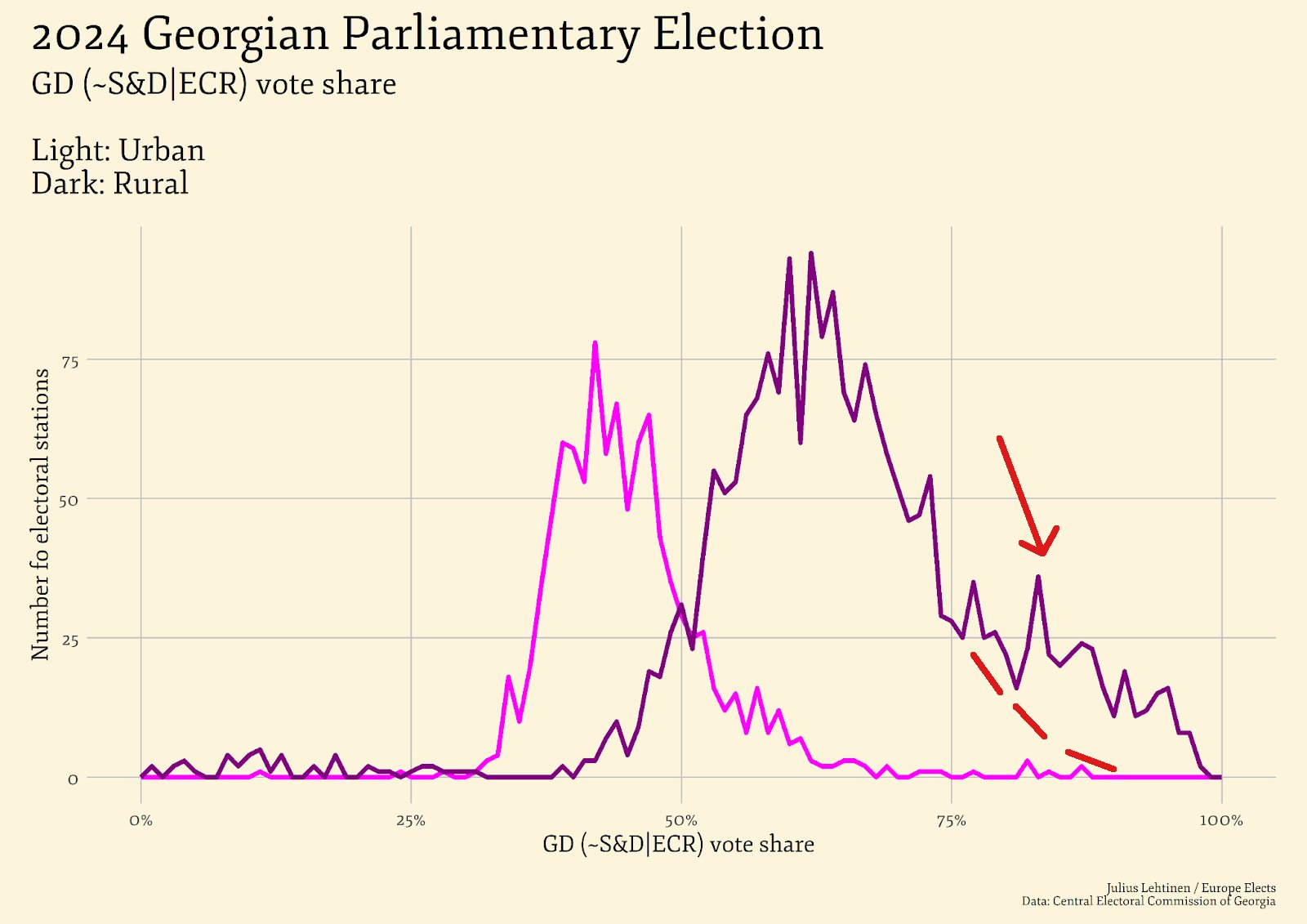
Intrigued by the discrepancies in rural & urban electoral data I have carried out some further analysis, to see if we can infer anything else. The electoral dataset I used is available here, and the code I used to make the plots is available here. I am neither a statistician nor a data scientist, however the beauty of plots is that those more experienced than me can use them to draw their own conclusions.
Government support vs. turnout
Scatter plots of ruling party support against turnout are one common way of identifying signs of voter fraud. To make one, take the reported results from every polling station, and plot each report as a dot, with voter turnout (votes cast / registered voters) on the \(x\)-axis, and ruling party support (votes for the ruling party / votes cast) on the \(y\)-axis.
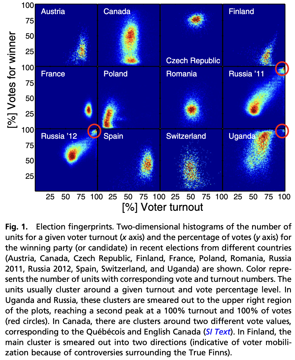
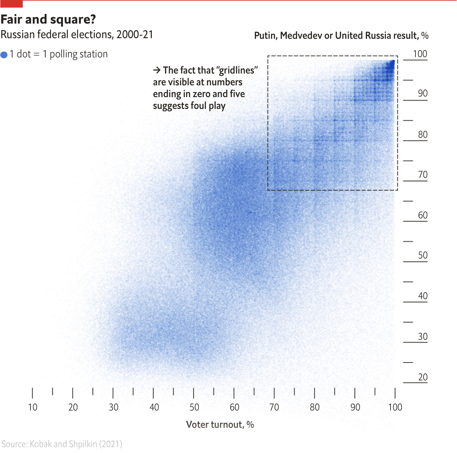
In a fair election, we would typically expect no correlation between the two – the proportion of votes each party gets should be (on average) the same regardless of how many people came out to vote in a particular constituency. However, observing a positive correlation between the two could suggest fraud took place: if a candidate is stuffing boxes or sending people to vote multiple times, this will raise the turnout rate in the affected polling stations. Since the additional votes then mostly go to the cheating candidate, their support rate also increases. This technique has been used, for example, in this political science paper (as well as this one) to detect systematic irregularities in elections. In the case of Russian elections, there is an additional artefact in the scatter plots. The below graphic from the Economist shows that on top of the strong turnout-support correlation, the scatter plot of two decades’ worth of Russian electoral data features prominent ‘gridlines’, suggesting that polling stations systematically make up the reported vote totals to fit predetermined rates of turnout and support.
Georgia 2024
We can look for similar ‘comet’ patterns in the Georgian electoral data. Below are some plots I made using Python. The first is a simple scatter plot (like the one in The Economist), and the other is a heatmap (made by dividing the scatter plot into a grid, and colouring each cell by the number of points it contains):
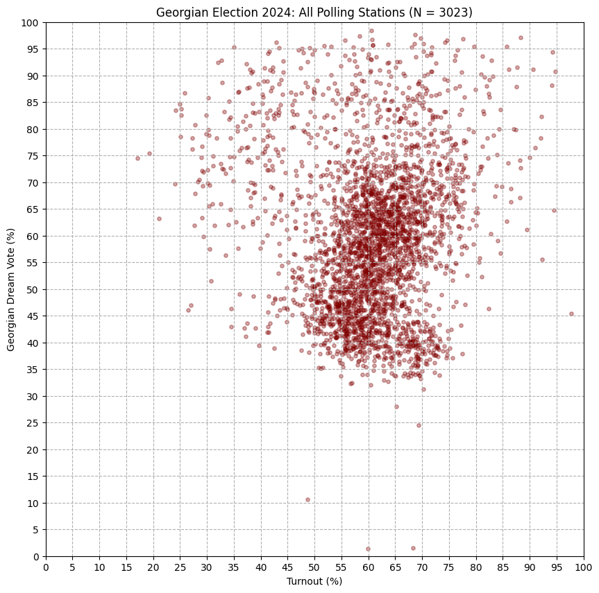
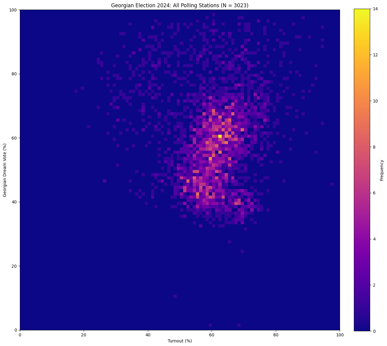
Though hard to articulate exactly, there seems to be a trend there: in one region of the plot, turnout looks correlated with GD vote share. In another (the lower ‘blob’), there is an opposite effect. It turns out these trends are not a coincidence: when we separate out data from urban and rural areas, we see that rural areas almost fully account for the ‘comet’ pattern. The pattern is nowhere as extreme as what we see in Russian, or Ugandan elections – but it is there:
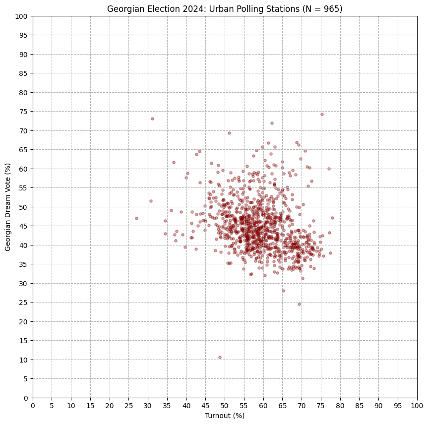
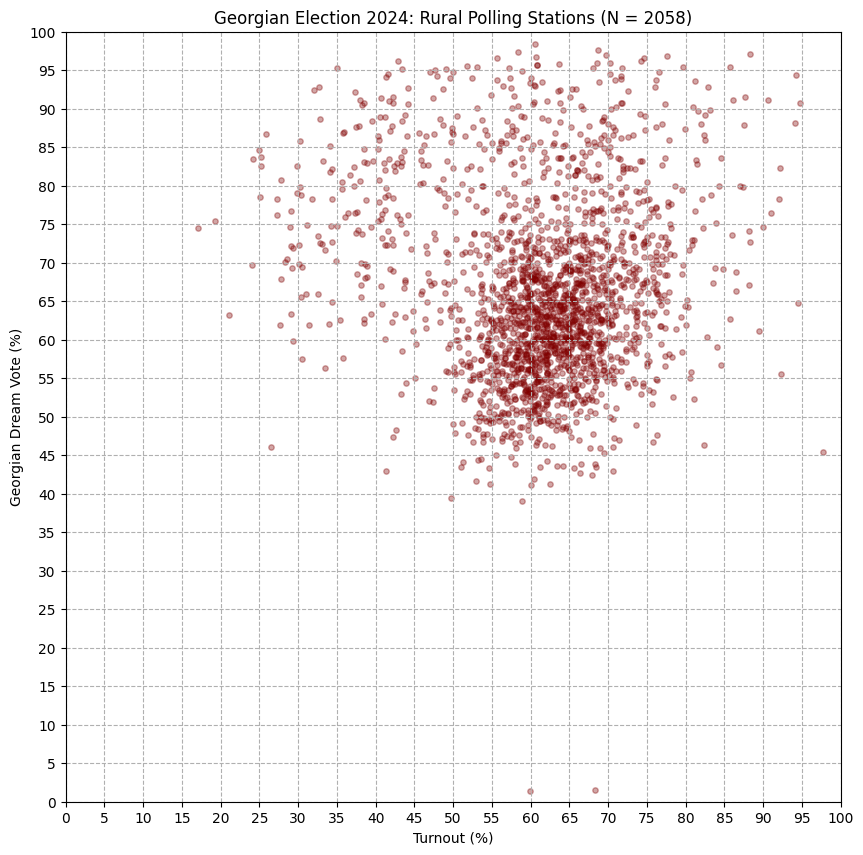
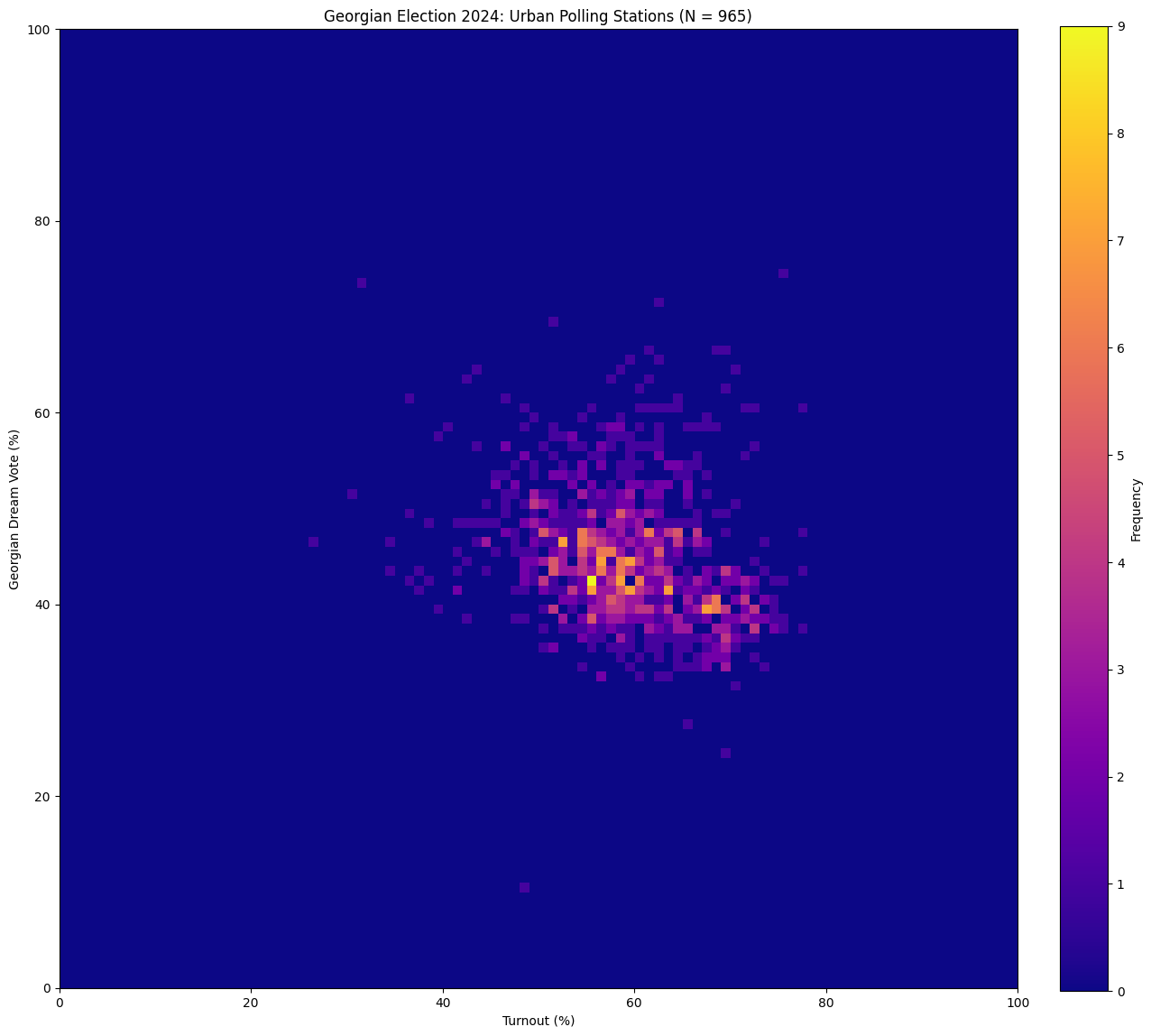
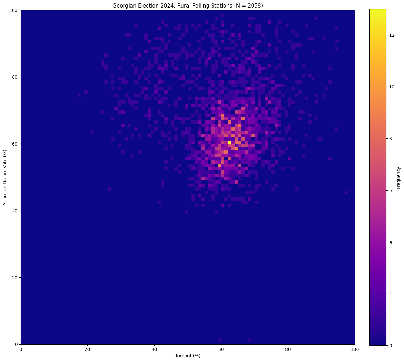
Of course, trends like this can be observed in fair elections too, whenever there is a strong and successful voting drive for a particular party. Usually, they are explainable through other phenomena observed around the election. In the case of Georgia, however, these patterns combined with the numerous reports of fraud seem to form a consistent story: it looks like Georgian Dream has been artificially inflating their vote share in rural areas.
Benford’s Law
Another way to look for irregularities in election data is to check whether it abides by Benford’s Law. This is a statistical rule that many naturally occuring datasets follow, and it states that the leading (leftmost) digits of numbers in the dataset appear with specific probabilities (\(P(d) = \log_{10} ( 1 + 1/d)\) where \(1 \leq d \leq 9\) is the leading digit). In checking whether the Georgian electoral data obeys this, I largely followed this blogpost by Jens Ringsholm who tested the Hungarian election for fraud. Because voting numbers from individual polling stations tend to be quite small (Benford’s law requires that the relevant data spans several orders of magnitude), I aggregated the CEC polling data by the District ID, and tallied the leading digit in the total vote count for each party for each district. The overall result is below:

As before, we can also compare the results from urban and rural areas:
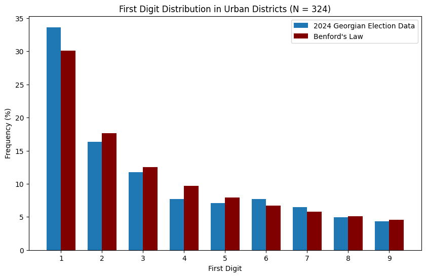
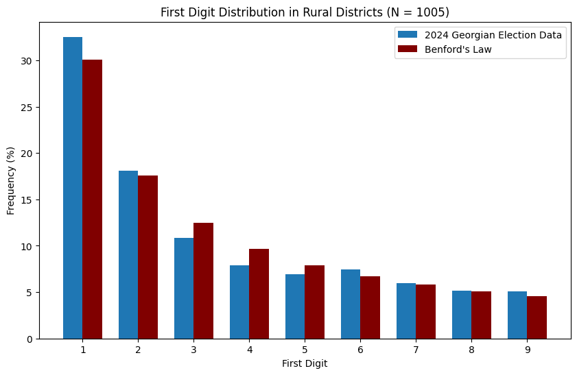
It mostly looks like the data follows Benford’s Law. However, some political scientists (see here for an example) also advocate for second digit analysis, i.e. checking that the second digits of numbers in the electoral dataset appear with the correct frequencies. The relevant plots for this are below:
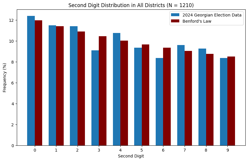
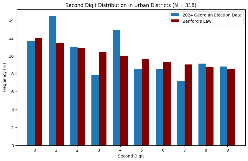
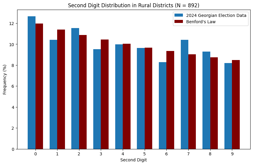
To me, for the rural data it mostly looks like the second digit distribution also adheres to Benford’s law. This does not rule out fraud, and in fact ballot stuffing can in principle lead to a ‘naturally’ distributed dataset. On the other hand, there seems to be something strange going on in urban areas, where second digits ‘1’ and ‘4’ are severely overrepresented, whilst ‘3’, ‘5’ and ‘7’ are underrepresented. In my view, with 318 data points this is not necessarily a statistical fluke. It is far beyond my expertise to investigate it further, but I hope somebody with experience will take a better look.
Again, I am not a researcher, but I hope the above manages to raise awareness about what’s going on in Georgia, and that it might inspire others to take a closer look at the rural vs. urban trends. Jupyter notebooks used to make the plots are freely available on my github; doing significance tests of the above findings might be a good way to proceed further.